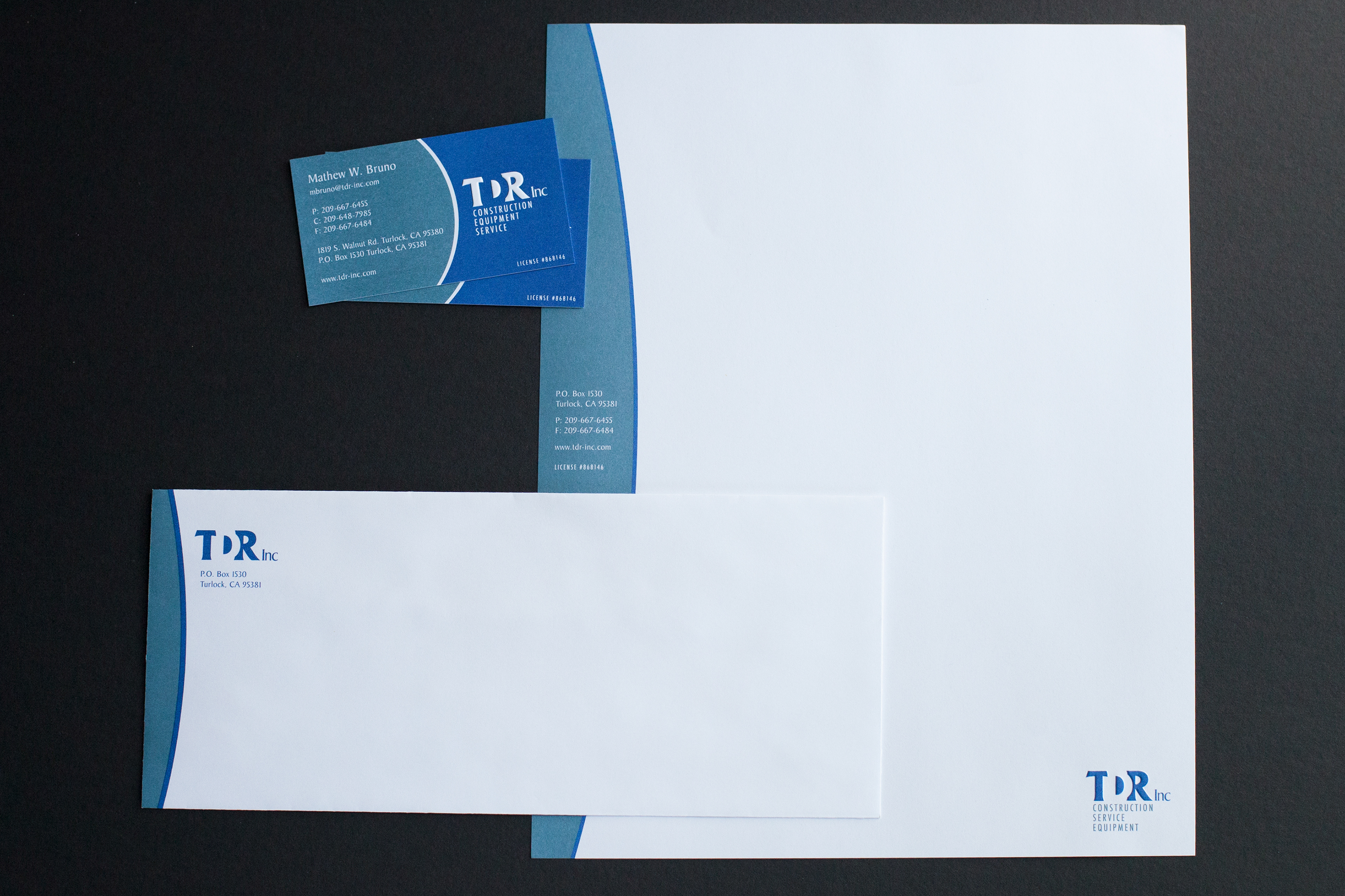
Client: TDR Inc.
Project: Identity and print materials
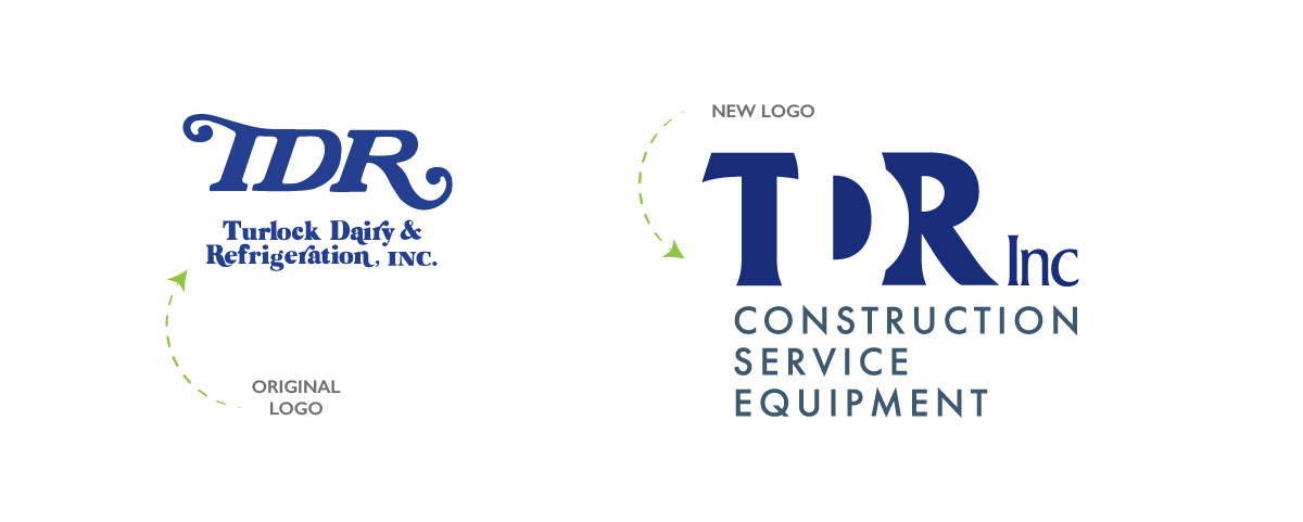
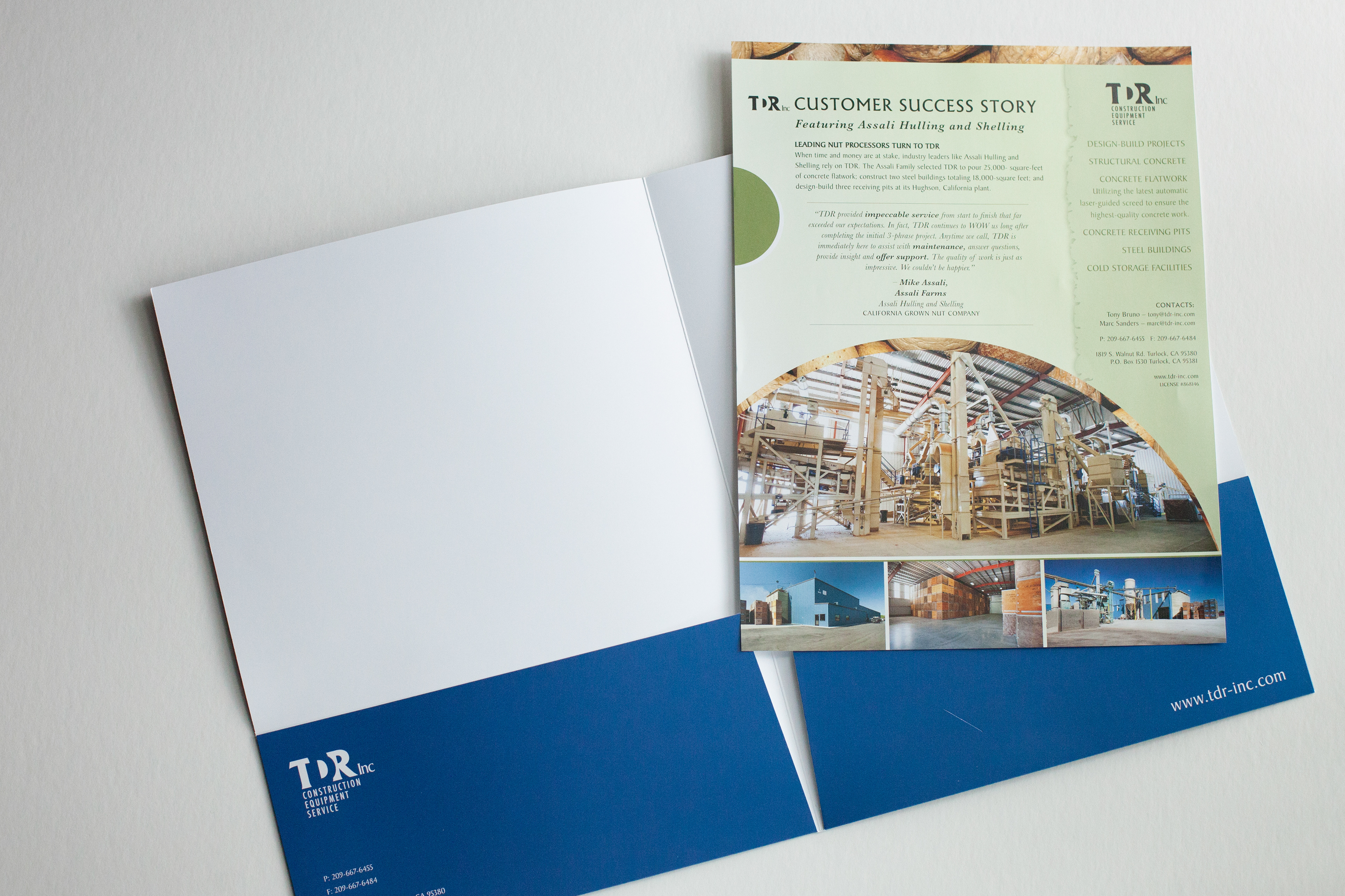
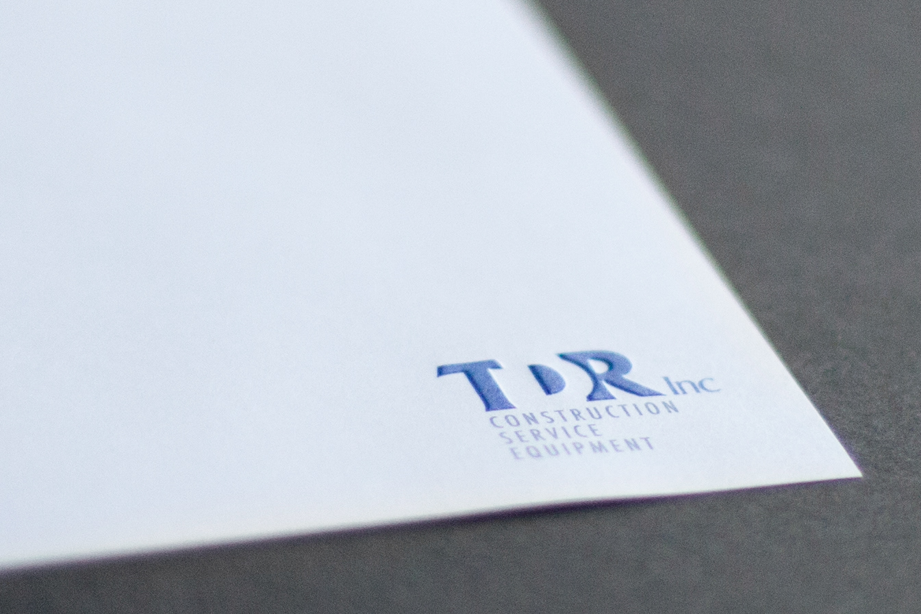
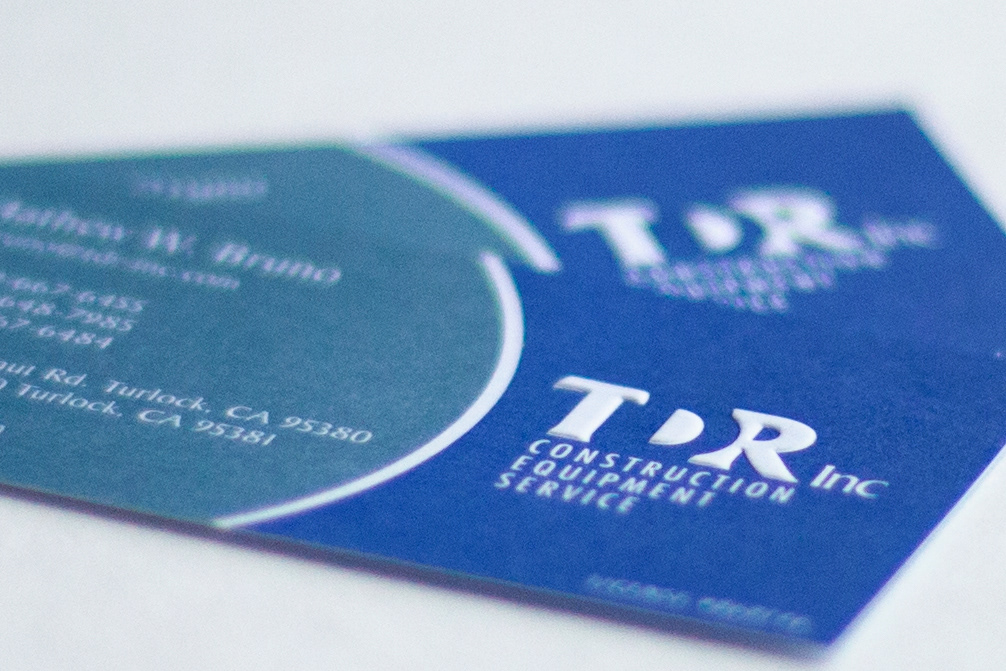
Description: Turlock Dairy Refrigeration (TDR) wanted to update it's look to a more modern look that still captured the quality and service of the 30 + year old brand they had built. To help maintain consistency, the new logo utilized the same all-caps TDR letters and the same blue spot color from the original mark. We updated the font, and changed the tag line to reflect their expanded services as well as used negative space to create the letter D. The business card and letterhead have the logo embossed to provide a tactile quality, reinforce their commitment to quality and highlight the positive/negative space of the letterforms.